Display Builder (V4): Design Your Delivery Date Widget
The Display Builder is where you decide exactly how delivery information appears to your shoppers. From a bold countdown timer to a clean, minimal date line — you control the look, feel, and content of every widget that appears on your product and cart pages.
What makes this section especially powerful is the Live Preview: as you change any setting, the preview at the top of the page updates in real time. You see the result immediately, without saving or refreshing. That means you can experiment freely until the widget looks exactly right for your store.
To open the Display Builder, go to Back Office → Modules → Estimated Delivery → Design.
Getting Started with the Live Preview
The Live Preview sits at the top of the Design tab and acts as your canvas. It shows a realistic simulation of the widget as it will appear in your storefront, using your current settings.
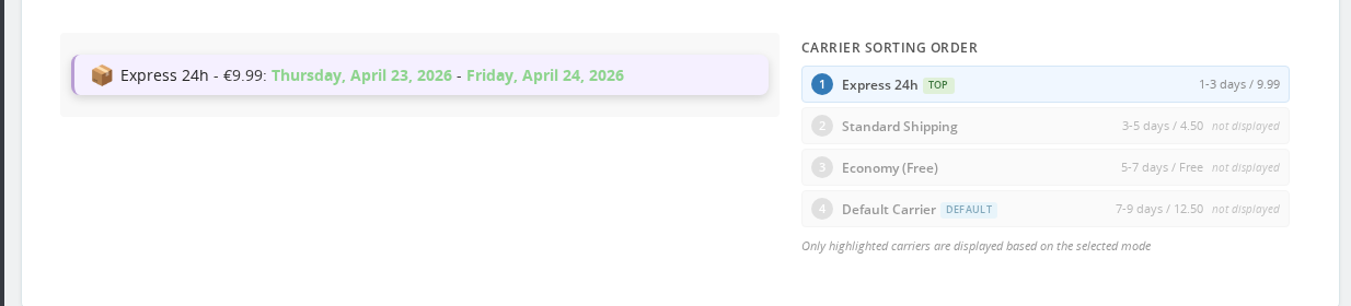
Every change you make anywhere in the left sidebar — display style, colors, border, icon, text format — is reflected in the preview the moment you adjust it. You do not need to save to see the result.
This makes the Display Builder ideal for iterating quickly. You might start with a preset that is close to what you want, then tweak the border color, adjust the spacing, and watch the preview settle into exactly the style your store needs. When you are happy with what you see, click Save to apply the configuration.
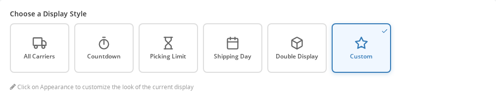
Choosing a Display Style
The Display Style selector is the most important decision you will make in this section. It determines what information is shown in the widget and how that information is structured. There are six modes to choose from.
All Carriers
This mode lists every carrier available for the current product, each with its own estimated delivery date. Shoppers can see at a glance which carriers are faster and what each option costs.
This is the right choice when you offer multiple shipping methods and want to give shoppers full transparency. It works particularly well for stores where shipping speed is a deciding factor — electronics, gifts, last-minute orders.
Countdown
The Countdown mode shows a ticking timer that counts down to the order cutoff time — the point after which orders placed today will ship tomorrow instead.
This creates a natural sense of urgency without resorting to gimmicks. When a shopper sees "Order within 2h 14m for delivery by Thursday", they understand exactly what is at stake. Use this mode when you have a clearly defined daily cut-off time and want to encourage faster decisions.
Picking Limit
Similar to Countdown, but instead of showing the dispatch deadline, this mode tells shoppers when their order will be picked and prepared in the warehouse. It is more internally focused — useful if your warehouse has a picking schedule that affects delivery times and you want to be transparent about it.
Shipping Day
This mode shows the specific day the order is expected to be shipped, rather than the delivery date. It suits stores where customers care more about when the parcel leaves the warehouse — for example, when they need to coordinate with a building site or delivery location.
Double Display
Double Display shows two rows of delivery information side by side. This is useful when you want to highlight, for example, both the expected delivery date and the shipping carrier, or display two different carriers prominently.
Custom
The Custom mode gives you full control over the widget message by letting you write your own template using placeholders. You can compose any message that combines carrier names, dates, prices, and contextual conditions.
This is the most flexible option and the one to reach for when the built-in modes do not quite say what you need. For example: "Free delivery with DHL — arrives by {date}", or a message that changes based on stock availability.
For a complete explanation of how to write custom templates, see the Message Templates guide.
Every display mode except Custom has an edit icon (✏) that appears when the mode is selected. Clicking it opens the full Custom mode editor for that mode — so you can keep the structure of "All Carriers" or "Countdown", but write your own message template around it. This gives you the flexibility of Custom without having to start from scratch.
Quick Start: Design Presets
If you are not sure where to start visually, the Appearance section offers 22 one-click design presets. Each preset applies a complete visual configuration — border, corner style, shadow, spacing, background color — in a single click.
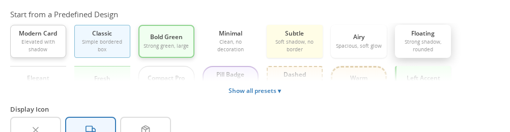
The available presets are:
Modern Card · Classic · Bold Green · Minimal · Subtle · Airy · Floating · Elegant · Fresh · Compact Pro · Pill Badge · Dashed · Warm · Left Accent · Top Bar · Urgent · Highlight · Statement · Double Line · Outlined · Dark Mode · Navy Accent
The Live Preview updates the moment you click a preset, so you can scroll through them rapidly and see which one feels closest to your store's style. Once you find a good starting point, you can override individual settings — colors, corners, spacing — without touching the rest.
A note on presets and custom colors: selecting a preset overwrites all appearance settings, including any custom colors you have entered. If you want to use a preset as a base but keep your brand colors, apply the preset first, then enter your custom color values afterward.
Customizing Appearance
Once you have chosen a preset (or if you prefer to build from scratch), the Appearance section lets you fine-tune every visual detail.
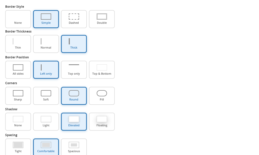
Border
The border gives the widget a defined edge that helps it stand out from the rest of the product page. You can choose the border style (None, Simple, Dashed, or Double), its thickness (Thin, Normal, or Thick), and which sides it appears on (All sides, Left only, Top only, or Top and Bottom).
A left-only border is a popular choice — it gives the widget a subtle highlight that feels modern and does not dominate the page. A dashed border can add a softer, more informal feel.
Corners
Corner rounding controls how sharp or smooth the widget's edges look. Sharp corners feel structured and precise. Soft corners are friendlier. Round corners give a card-like appearance. Pill corners make the widget look like a badge — eye-catching and compact.
Match this to the overall aesthetic of your theme. If your buttons and product cards have round corners, matching the widget to them creates visual cohesion.
Shadow
A shadow lifts the widget slightly off the page, giving it a card-like depth. None keeps it flat. Light adds the faintest suggestion of depth. Elevated gives a clearly raised effect. Floating creates a strong drop shadow that makes the widget pop.
Use shadows sparingly — they work best when the rest of your product page is relatively flat.
Spacing and Text Size
Spacing controls the internal padding of the widget. Tight (4px / 8px) is good for compact page layouts. Comfortable (8px / 14px) suits most stores. Spacious (14px / 20px) gives the widget breathing room and makes it feel premium.
Text size is separate: Small (12px) for minimal designs, Medium (14px) as the default, Large (16px) when you want the delivery date to be the most prominent element on the product page.
Margin
Margin controls the space between the widget and the elements around it — typically the Add to Cart button and product description. Normal (10px top and bottom) is a reliable default. Roomy (20px) gives the widget more prominence. Flush (0) removes the gap entirely, useful when your theme already handles spacing.
Colors and Text Formatting
The Colors & Format section lets you set a custom color and text style for each of the four elements that can appear in the widget.
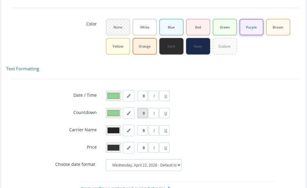
The four elements are:
- Delivery dates — the estimated arrival date or date range
- Countdown timer — the ticking countdown shown in Countdown mode
- Carrier name — the name of the shipping carrier
- Carrier price — the shipping cost associated with the carrier
For each element, you can set:
Color — a hex color value. This overrides the widget's default text color for that element only. Useful for drawing attention to the delivery date (your primary message) while keeping the carrier name and price in a more neutral tone.
Text formatting — Bold, Italic, and Underline, in any combination. These options use a bitmask internally: Bold = 1, Italic = 2, Underline = 4. In practice, you set them through checkboxes in the interface — the numbers are how the module stores your choices behind the scenes. You can combine them freely: Bold + Italic gives the date a strong emphasis, for example.
A common approach is to make the delivery date text Bold and give it your brand's accent color, while leaving the carrier name in the default style. This draws the shopper's eye to the most important information first.
Placement
The Placement section controls where on the product page the widget appears.
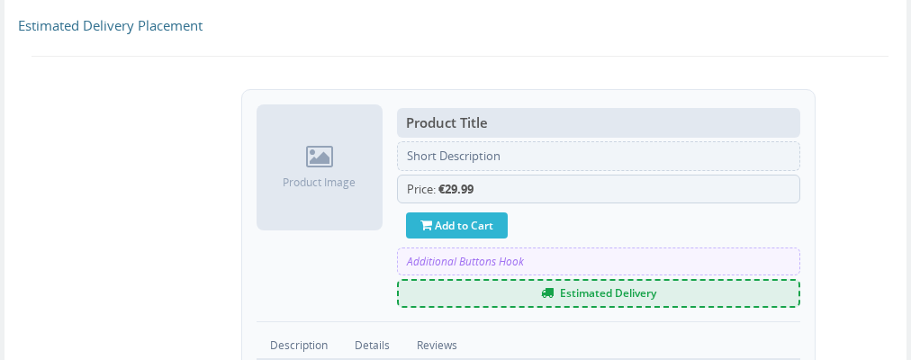
Choose placement based on your shoppers' natural reading flow. Most stores find that placing the widget directly above or below the Add to Cart button works best — it appears at the moment the shopper is deciding whether to buy, which is exactly when delivery information is most persuasive.
Custom CSS
The Custom CSS field at the bottom of the sidebar is for advanced users who need control beyond what the visual settings provide. Anything you enter here is injected into the page alongside the widget, scoped to the widget's container.
You can use this to apply styles that match highly customized themes, adjust the widget for specific breakpoints, or override a preset detail that does not have a dedicated setting.
If you are comfortable with CSS, this field gives you complete freedom. If not, the visual settings alone will cover the needs of the vast majority of stores.
Tips for a Professional Look
Getting a widget that feels native to your store — rather than bolted on — comes down to a few consistent choices.
Match your theme's corner style. If your buttons have rounded corners, give the widget rounded corners too. Consistency in shape creates a coherent design language across the page.
Use your brand's accent color for the date. The delivery date is the most important piece of information in the widget. Setting it to your store's primary or accent color makes it feel intentional rather than generic.
Keep spacing generous. A cramped widget feels like an afterthought. Comfortable or Spacious spacing, combined with a Normal or Roomy margin, gives the widget room to breathe and makes it feel like a proper part of the page.
Start with a preset, then adjust. Even if none of the presets is perfect, they all provide a solid visual baseline. It is faster to start from Minimal or Subtle and change one or two things than to build from scratch.
Preview on a real product. The Live Preview shows the widget in isolation. Once you are happy with it, check a real product page in your storefront to see how it sits alongside your product images, description, and buttons.
Frequently Asked Questions
The Live Preview is not updating when I change settings. What should I do?
Try refreshing the Design tab page. If the preview still does not update, check that JavaScript is enabled in your browser and that no browser extension is blocking scripts on back-office pages. The Live Preview relies on a small JavaScript listener that watches for setting changes.
I applied a preset and now my custom colors are gone. Can I get them back?
Presets overwrite all appearance settings, including custom colors. If you applied a preset by accident, you can re-enter your color values in the Colors & Format section without needing to revert the whole preset. Going forward, always apply the preset first, then set your custom colors.
Can I show a different widget style on the cart page than on the product page?
The Display Builder applies one global configuration that covers all placements — product page, cart page, and any other location where the widget appears. If you need meaningfully different content per page type, the Custom display style with message templates gives you the most flexibility through conditional blocks.
What does the bitmask number mean in the Colors & Format section?
The bitmask is how the module stores your text formatting choices behind the scenes. You do not need to type numbers — the interface shows checkboxes for Bold, Italic, and Underline. When you check multiple boxes, the module adds their values together (Bold = 1, Italic = 2, Underline = 4). For example, Bold + Italic is stored as 3. This is only relevant if you are reading configuration export files or setting values via the API.
Does the Display Builder affect how delivery dates look in order confirmation emails?
No. The Display Builder only controls the front-office widget on product and cart pages. Delivery date formatting in emails is configured separately through the Email Variables settings.
Can I set different widget styles per carrier?
The Display Builder applies a single global style to all carriers shown in the widget. To differentiate carriers visually or textually, use the Custom display style with message templates, where you can write conditional content based on carrier name or other variables.
Related
- Message Templates — write custom delivery messages with placeholders and conditions
- Estimated Delivery Styles — additional CSS customization reference
- Email Variables — configure delivery date formatting in transactional emails
- Cache System — understand how delivery date results are cached and refreshed
- Widget and Page Builder — embed the widget in additional locations on your store